Black males in Michigan die at an alarming rate
 CLICK to enlarge
While Michigan may be aging faster than any other state, our overall death numbers are not growing. Provisional death totals for 2011, just released by Michigan’s Department of Community Health, show that the total number of deaths in Michigan fell by 313 between 2010 and 2011. If we were to look at the last three years (2009-11) compared to the previous three (a common method used in health circles to account for one year anomalies) we would see an average annual increase of 478 deaths or 0.5 percent.
Let’s just look at the one-year trend for a moment. County trends came out even with 41 decreases and 41 increases. Only Luce County, with a mere 65 deaths, experienced no change. Wayne County had the largest numeric decrease of 508, followed by Calhoun (126), Kalamazoo and Menominee (both at 117). Something was happening on the southwest side of the state because Cass, St. Joseph and Berrien counties also experienced “healthy” decreases. Menominee, which dropped from 272 to 155, experienced, by far, the largest percentage decrease at -43 percent. Menominee also experienced a jump of six births between 2010 and 2011, after years of decline, with births outnumbering deaths! Could we be on the verge of future growth?
The largest numerical increase in deaths occurred in Macomb County at 314. Kent was a distant second with 146, followed by Ingham (95), Monroe (93) and Midland (91). When we change the view to greatest percentage increase we find Benzie (-19.1 percent), Osceola (-18.2) and Charlevoix (-16.9), all counties with less than 300 annual deaths.
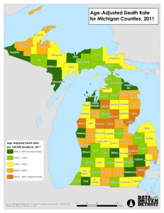
So as not to disturb the health researchers in our reading audience, I will now move to an analysis using 3-year averages and compare the 2006-2008 and 2009-2011 periods. Now we find 56 counties with increasing deaths, 26 with decreasing deaths and Montcalm which held steady. (See accompanying map to know how your county compares.)
The large numerical decreases occurred in the counties that have experienced significant levels of population loss – Wayne and Saginaw counties. The question is whether these trends are really correlated? Are we losing an older cohort who is dying elsewhere or does population loss lead to longer lifespans for those who remain? In addition, a number of the Upper Peninsula counties have seen death numbers decline as well.
The largest numerical increases were found in Oakland (276 or 3.0 percent), Macomb (259 and 3.5), Kent (128 and 3.1), Genesee (122 and 3.1), Livingston (103 and 9.0) and Kalamazoo (100 and 5.2).
In addition to county death totals, the new data provide us with another way to compare counties – by age-adjusted death rates[1]. When viewed this way, deaths take on a very different look. In fact, the county with the lowest age-adjusted death rate of 409.4 (Menominee, which is nestled next to Wisconsin in the Upper Peninsula) is less than half that of the 18 counties with the highest rates. At the top of the list is Kalkaska at 909.5, just east of Grand Traverse County where the rate was just 677.6.
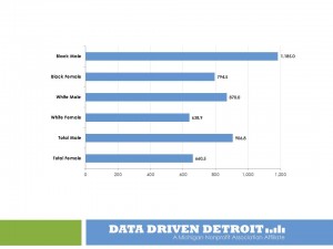
One last analysis that the new data allow is gender and race (only white and African American) age-adjusted death rates. Figure 1 looks at the rates by gender and race for all deaths, while Figure 2 targets the population cohorts of 15 to 24 and 25 to 34 years of age.
 CLICK to enlarge
Figure 1 clearly shows that white females have the lowest age-adjusted death rate while African American men have the highest. In fact, the rate for African American men is 1.85 times higher. While the rate for African American females is 1.24 times higher than that of white females, it is less than the rate (0.91) of white males.
The discrepancy between the death rates of African-American males and the other groups is accentuated when we study specific age cohorts. It is well-documented that young African-American males tend to be concentrated in central-city neighborhoods with high rates of crime. We hear about the “mean streets” and the “school to prison pipeline.” We know too well the results of “institutional racism.”
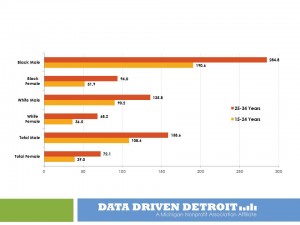
Figure 2 shows these results very clearly. Higher infant death rates for African Americans as a whole (2.6 to 1), both male and female, give way to a reduced age-adjusted death rate discrepancy (1.9 to 1) for the 1 to 14 years of age cohort. The rate for African-American males and females at this age is the same. However, the picture changes dramatically once our youth reach their early teens and move through their early 30s.
 CLICK to enlarge
Figure 2 shows the age-adjusted rates by race and gender for the 15-24 years of age and 25-34 years of age cohorts.
It is easy to see the large discrepancies between African-American males and each of the other three groups.
The 190.6 deaths per 100,000 rate for 15-24 year olds is 2.1 times that of white males and 3.7 times that of African-American females.
The rate for 25-34 year old African-American males jumps to 284.8 per 100,000! This is still 2.1 times that of white males, with a slight reduction to 3.0 times that of African-American females.
While the details for 2011 are not yet available, a review of 2010 shows clearly the leading factors driving these rates. African-American males 15-24 years of age had homicide, accidents and suicide as the three leading causes of death. Homicide was way ahead of the others and accounted for 103.6 deaths per 100,000. Accidents ranked number 1 for white males with a rate of only 35.8 per 100,000. Homicide ranked fourth in the list with a rate of 2.5. The African-American male rate was 41 times higher! While the homicide rate goes up for both races in the 25-34 years of age cohort, the rank is still number 1 for African Americans and number 5 for whites, the ratio drops slightly to 28 to 1.
While we started out looking at what the new death data tell us geographically, we finish with a much more important story. In order for Michigan to be successful, all its residents need access to opportunity – in services, in public safety, in education and resources across the board. Too many black and brown boys are growing up in conditions of very low opportunity and must truly “beat the odds” to not be another statistic. We have blamed the victim for too long. Let us acknowledge the realities and institute the policies and programs that will help to reverse the trend and provide the resources for success.
[1] Age adjusting rates is a way to make fairer comparisons between groups with different age distributions. For example, a county having a higher percentage of elderly people may have a higher rate of death or hospitalization than a county with a younger population, merely because the elderly are more likely to die or be hospitalized. Age adjustment can make the different groups more comparable.
See what new members are saying about why they donated to Bridge Michigan:
- “In order for this information to be accurate and unbiased it must be underwritten by its readers, not by special interests.” - Larry S.
- “Not many other media sources report on the topics Bridge does.” - Susan B.
- “Your journalism is outstanding and rare these days.” - Mark S.
If you want to ensure the future of nonpartisan, nonprofit Michigan journalism, please become a member today. You, too, will be asked why you donated and maybe we'll feature your quote next time!